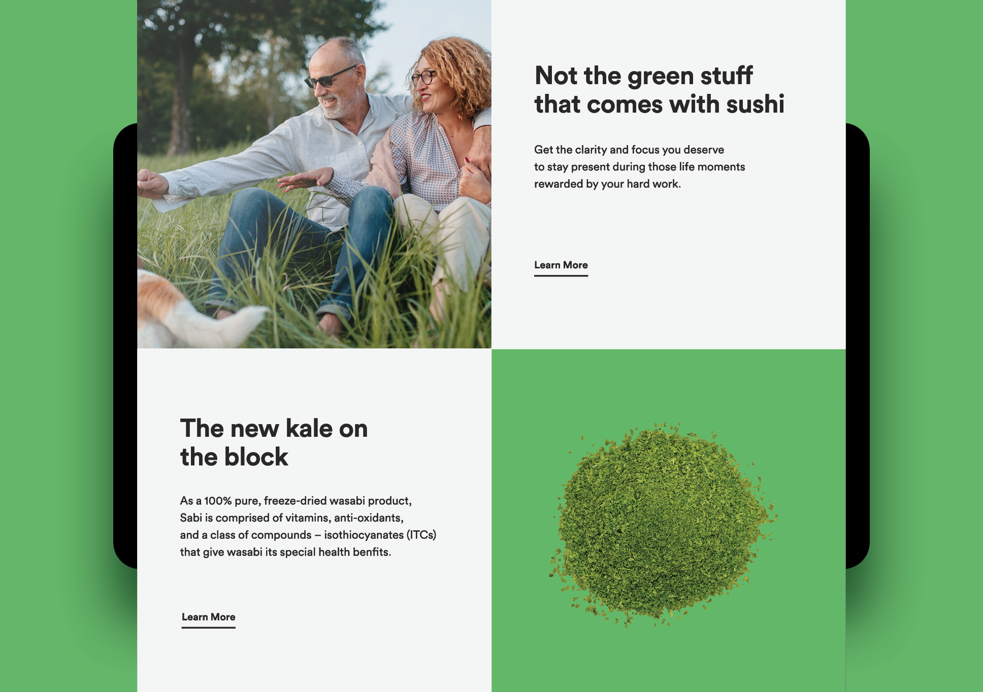
Sabi is a revolutionary health product made solely from 100% pure, unadulterated wasabi, free from additives, colouring, or horseradish substitutes. Backed by science and steeped in tradition, it enhances memory, focus, and mental clarity through the natural power of wasabi’s antioxidant, antibacterial, and anti-inflammatory properties.
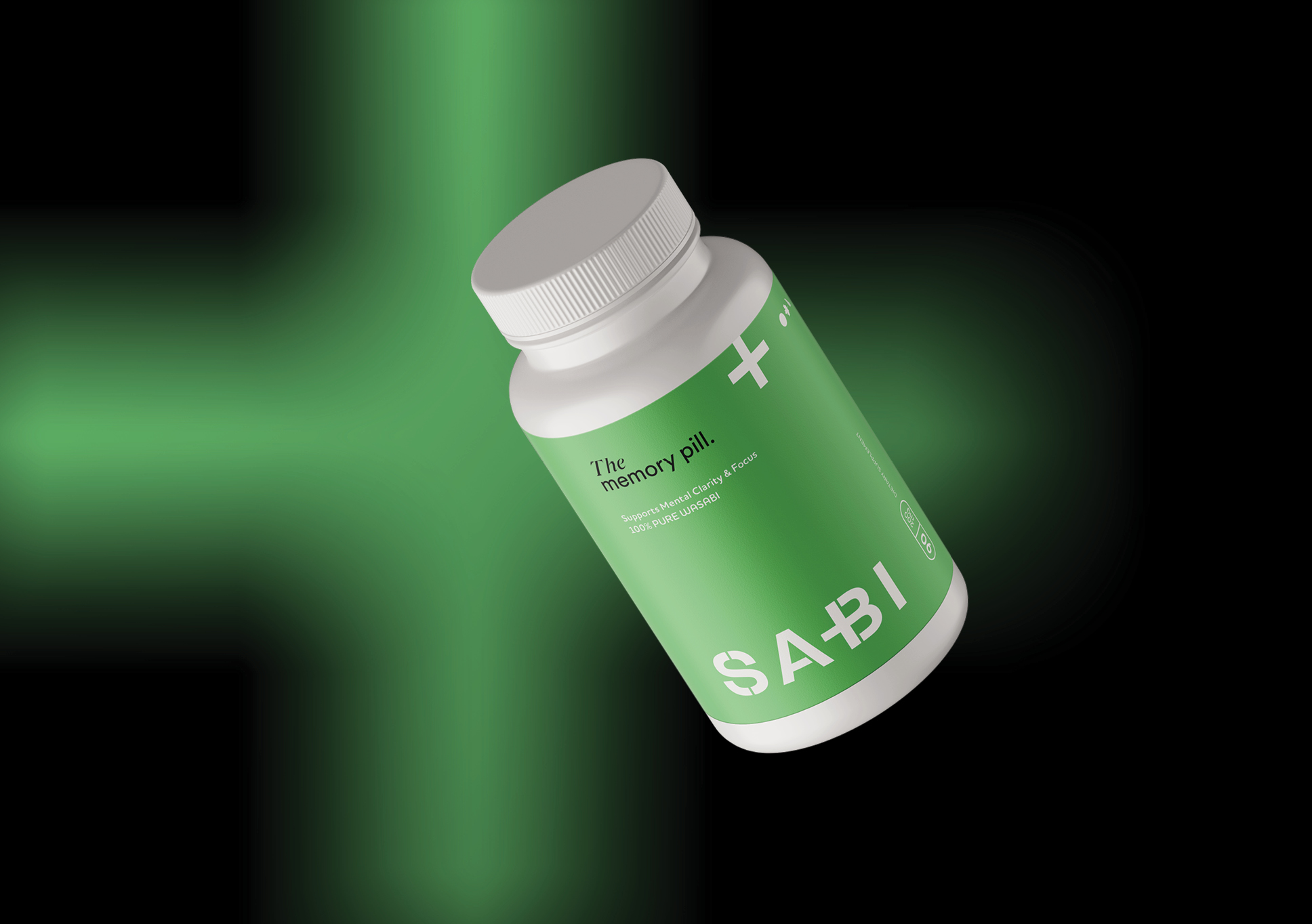
Our challenge was to redefine the brand to better reflect its unique value and potential, repositioning it as more than just a supplement; it's a life changer. We began by crafting a new name and visual identity that embodies Sabi’s promise of ‘more’: more purity, more performance, more life. Drawing from health cues, we designed a bold yet refined identity, anchored by a logo that playfully emphasises the cross in the uppercase ‘B’, a symbol of both health and focus. The black and green colour palette further supports the brand’s purity and sophistication. Green is not only the colour of wasabi, but also symbolises nature and evokes qualities of tranquillity, health, and youth. The result is a brand that is successfully positioned as a premium product born of tradition, driven by innovation, and ready for life.