WDOM, pronounced DOM, produces milk products for local supermarkets and offshore markets. The business has operated in the sector for 14 years. Over those years, WDOM has developed and produced an impressive suite of innovative milk products and built many enduring and fruitful working relationships.
While New Zealand is an important market, WDOM wanted to reposition the brand as a New Zealand company in offshore markets, namely China, Southeast East Asia and the Middle East. These markets want products that are nutritious, safe and authentic.
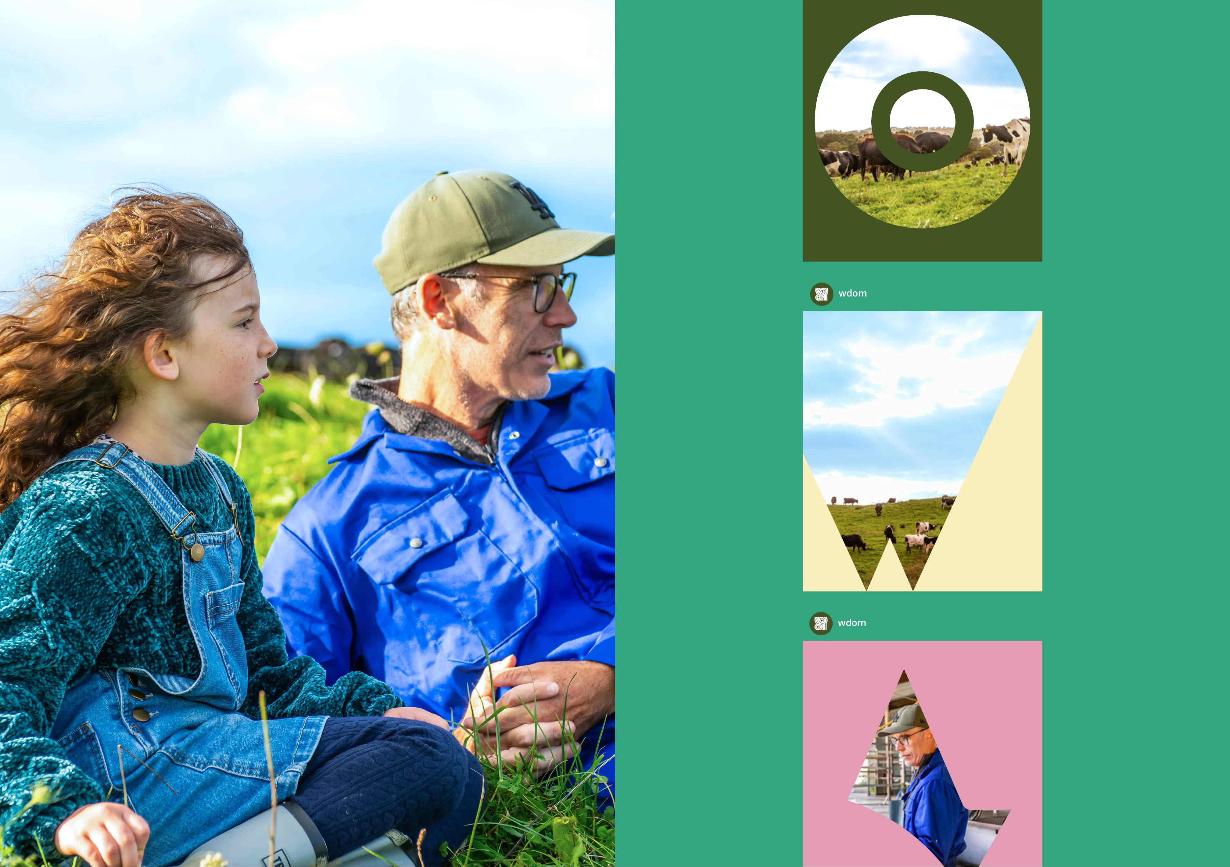
Our challenge was to create a brand expression that tells an authentic New Zealand story, engenders trust and builds a brand presence that drives powerful and enduring connections with consumers, customers, distributors and markets.
The logo treatment was inspired by topographic features of farmland, transforming the WDOM letterforms into an aerial view of New Zealand’s unique environment.
The deep green in the colour palette is inspired by the New Zealand landscape. In contrast, the pastel pink, green, yellow, and cream create a strong association with the milky white of the brand's products and add a contemporary twist to the earthy green. And the graphic extensions of the logo artfully frame copy and images to further elaborate the visual story.